Nymbor
LOADING

Spreadshop redesign case study

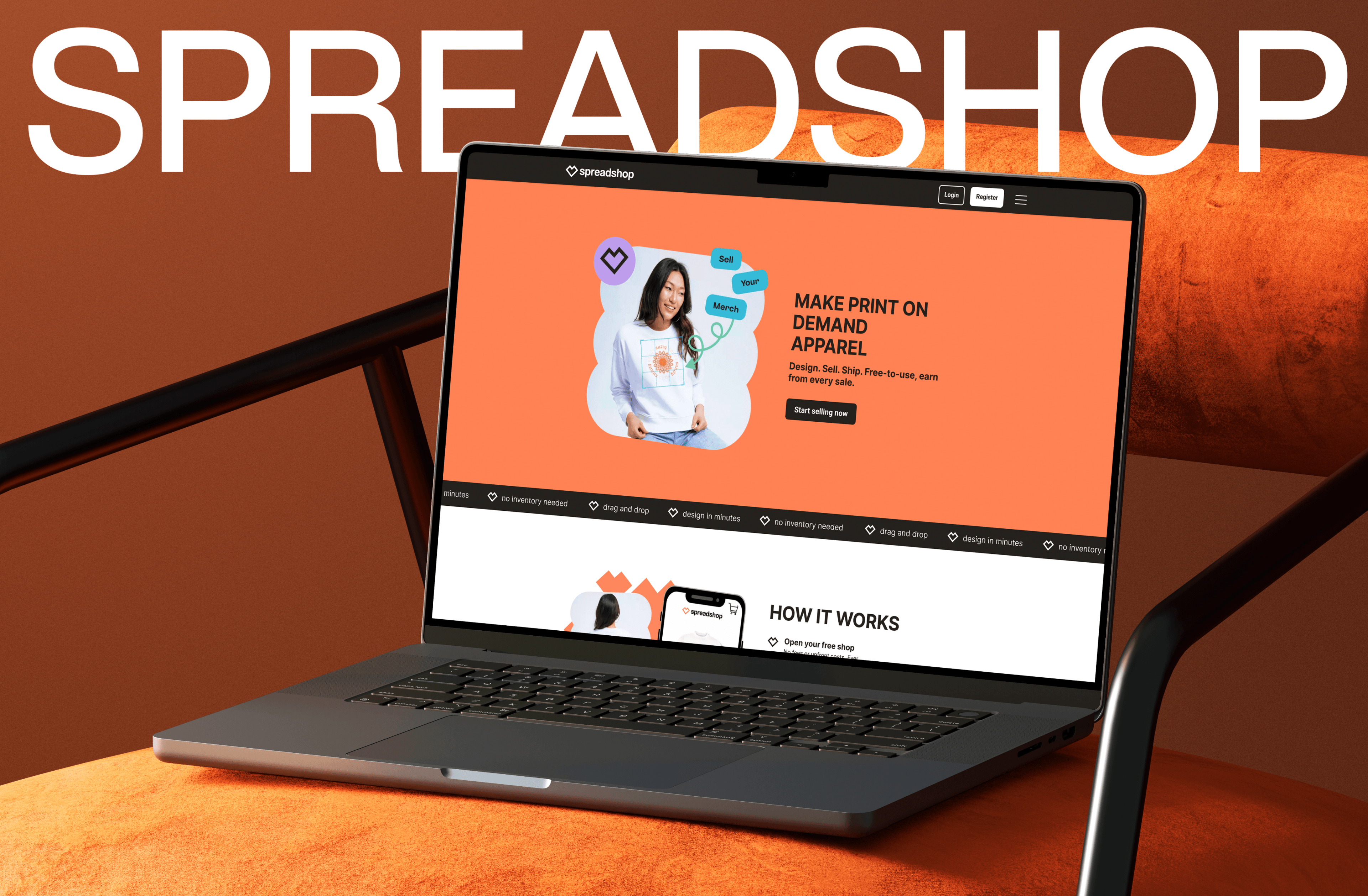
Spreadshop storefront redesign displayed on a laptop in an orange studio setting

Case Study

Spreadshop Redesign

2024

About The Project

A ground-up redesign of Spreadshop's creator storefront platform solving discoverability, trust, and conversion failures across the entire purchase funnel.

+23%

Conversion Rate

projected

-12%

Bounce Rate

projected

3.1s

LCP (was 4.2s)

projected

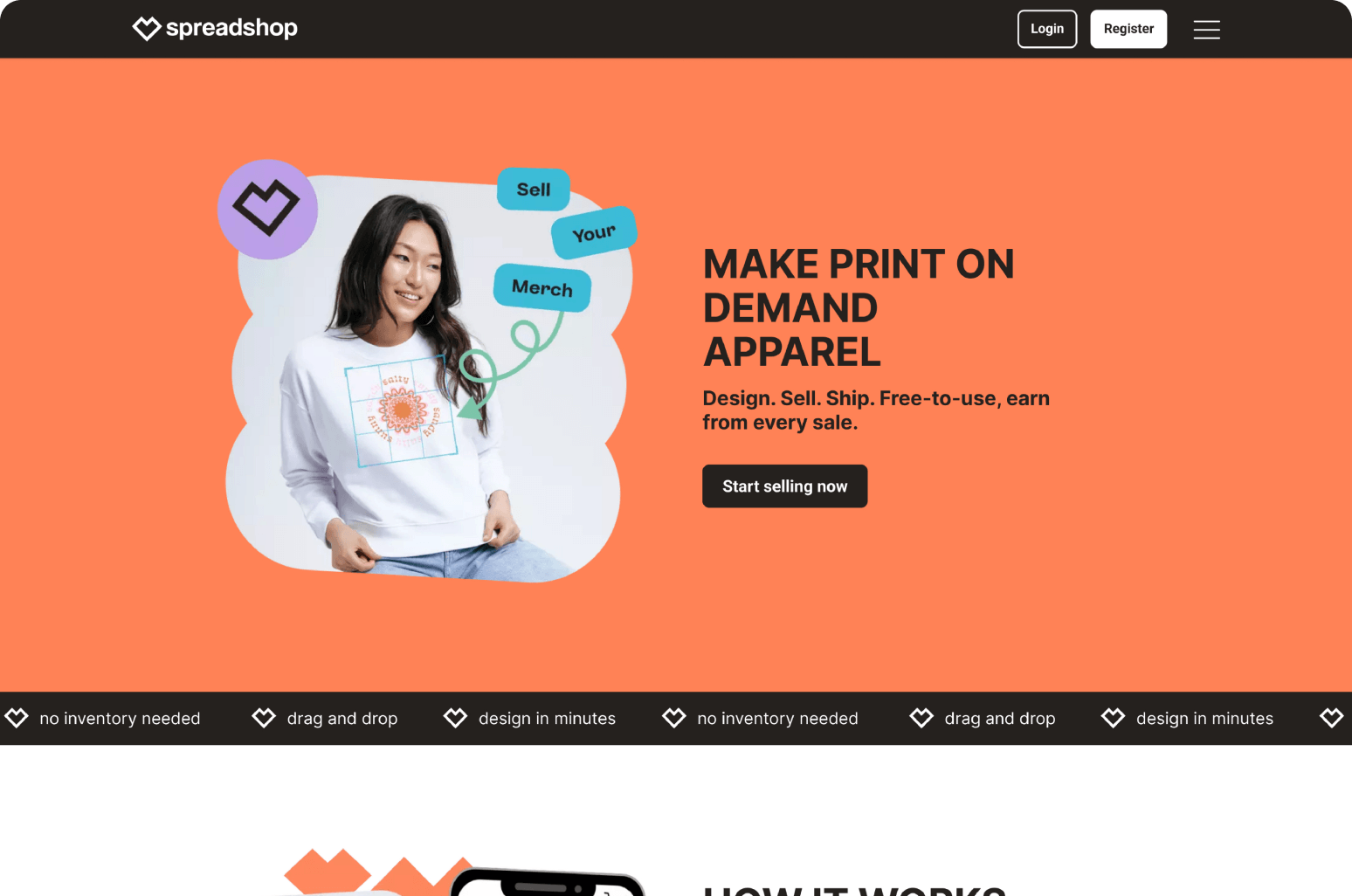
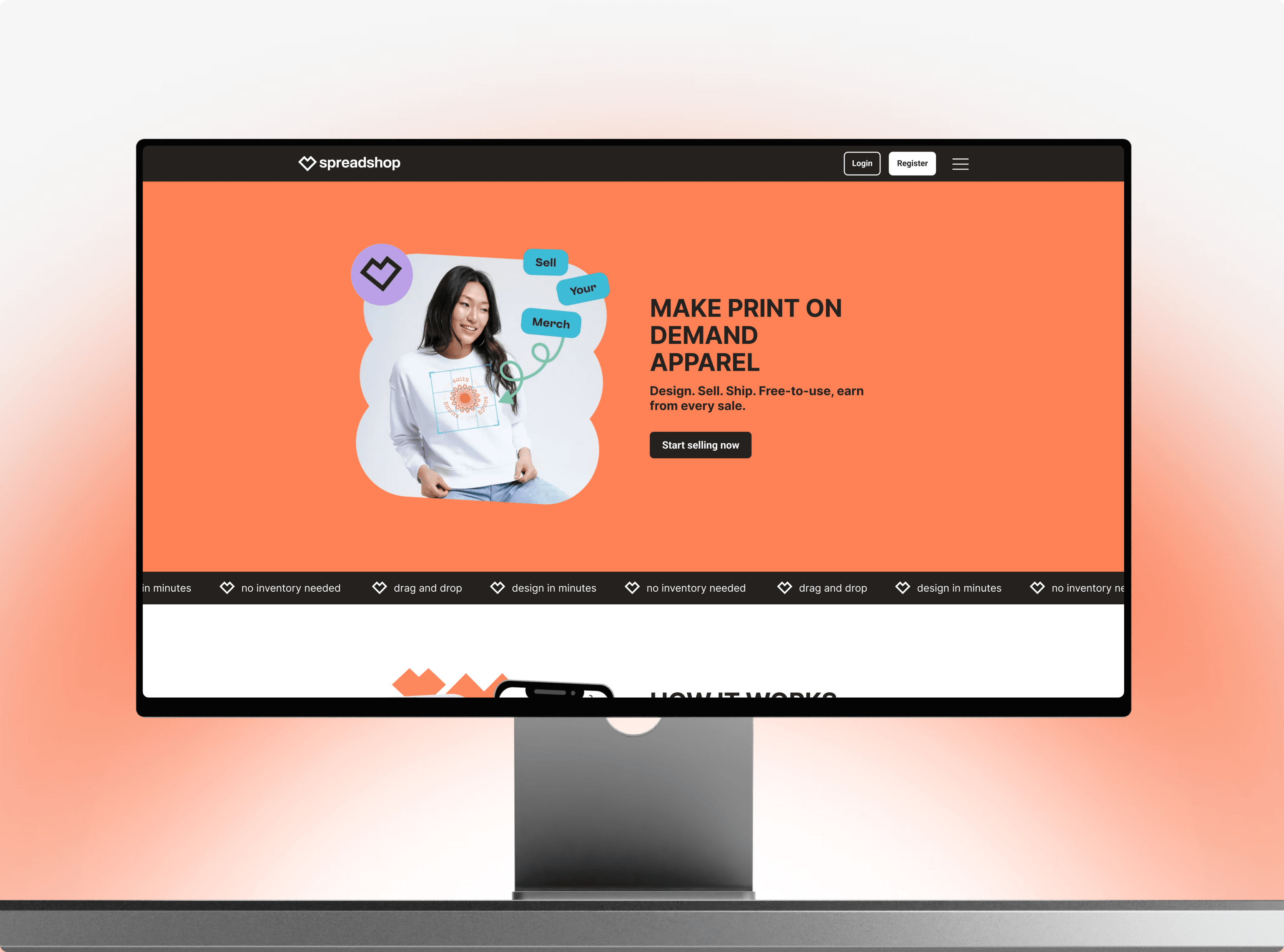
Spreadshop redesigned storefront hero with creator merchandise
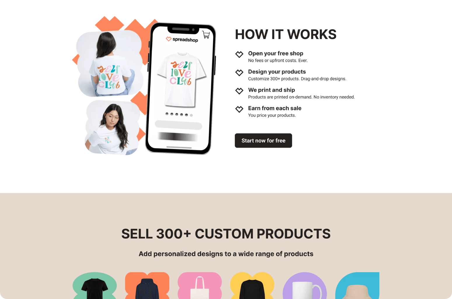
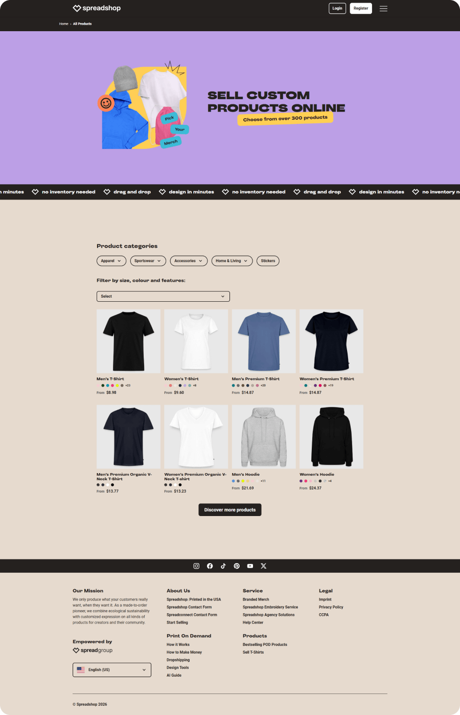
Spreadshop redesigned storefront explaining how the platform works

Role

Lead Product Designer, with solo end-to-end ownership across research, UX, visual design, and prototype validation.

Challenge

Spreadshop's interface had accumulated four years of feature additions without a cohesive design strategy. Trust signals were buried, CTAs competed, and mobile conversion was 61% below desktop.

Goal

Increase storefront conversion rate by 15%+ within two months of launch, reduce bounce on the homepage, and cut Largest Contentful Paint below 3.5s.

Design Process

Discovery

Analysis
Research

Strategy

User Experience
User Interface

Solutions

Web Design
Development

Competitor analysis

Where Spreadshop fell behind

A structured audit of four competing platforms across five key UX dimensions revealed consistent gaps in Spreadshop's pre-redesign experience.

Spreadshop (before)

Onboarding flow
Weak
Product discoverability
Weak
Mobile experience
Weak
Trust signals
Weak
Checkout speed
Weak

Fourthwall

Onboarding flow
Strong
Product discoverability
Strong
Mobile experience
Strong
Trust signals
Partial
Checkout speed
Strong

Spring

Onboarding flow
Strong
Product discoverability
Partial
Mobile experience
Strong
Trust signals
Weak
Checkout speed
Strong

Bonfire

Onboarding flow
Partial
Product discoverability
Strong
Mobile experience
Partial
Trust signals
Strong
Checkout speed
Weak

User Research

Journey before & after

Session recordings (n=240) and tree-testing with 80 participants revealed a predictable pattern of friction. The redesign restructured the funnel around the user's actual mental model.

Before

  1. Land on site
  2. Four CTAs compete
  3. Navigate product grid
  4. Search for reviews
  5. Reach checkout
  6. Abandon

After

  1. Land on site
  2. Single CTA in view
  3. Browse editorial grid
  4. Trust signals in hero
  5. Express checkout
  6. Convert
Spreadshop dashboard presented on a laptop
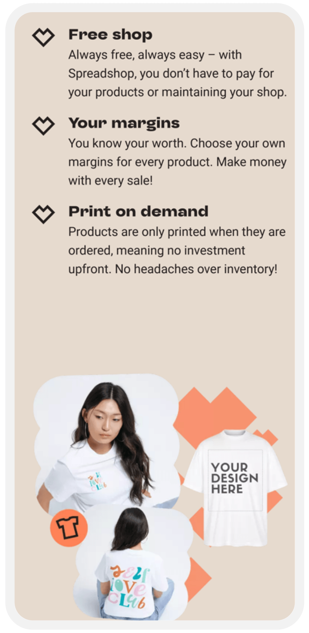
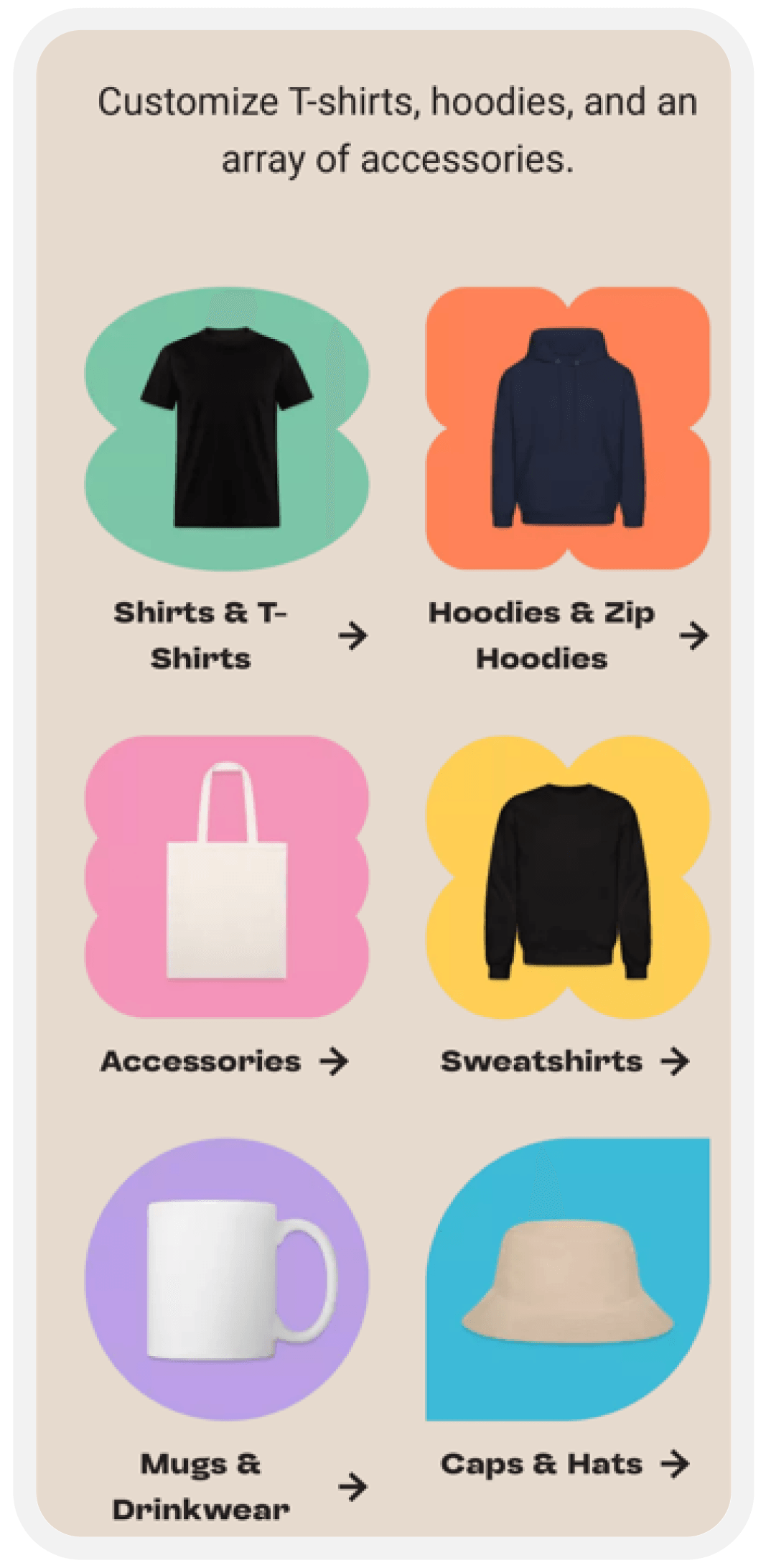
Spreadshop mobile interface screen 1
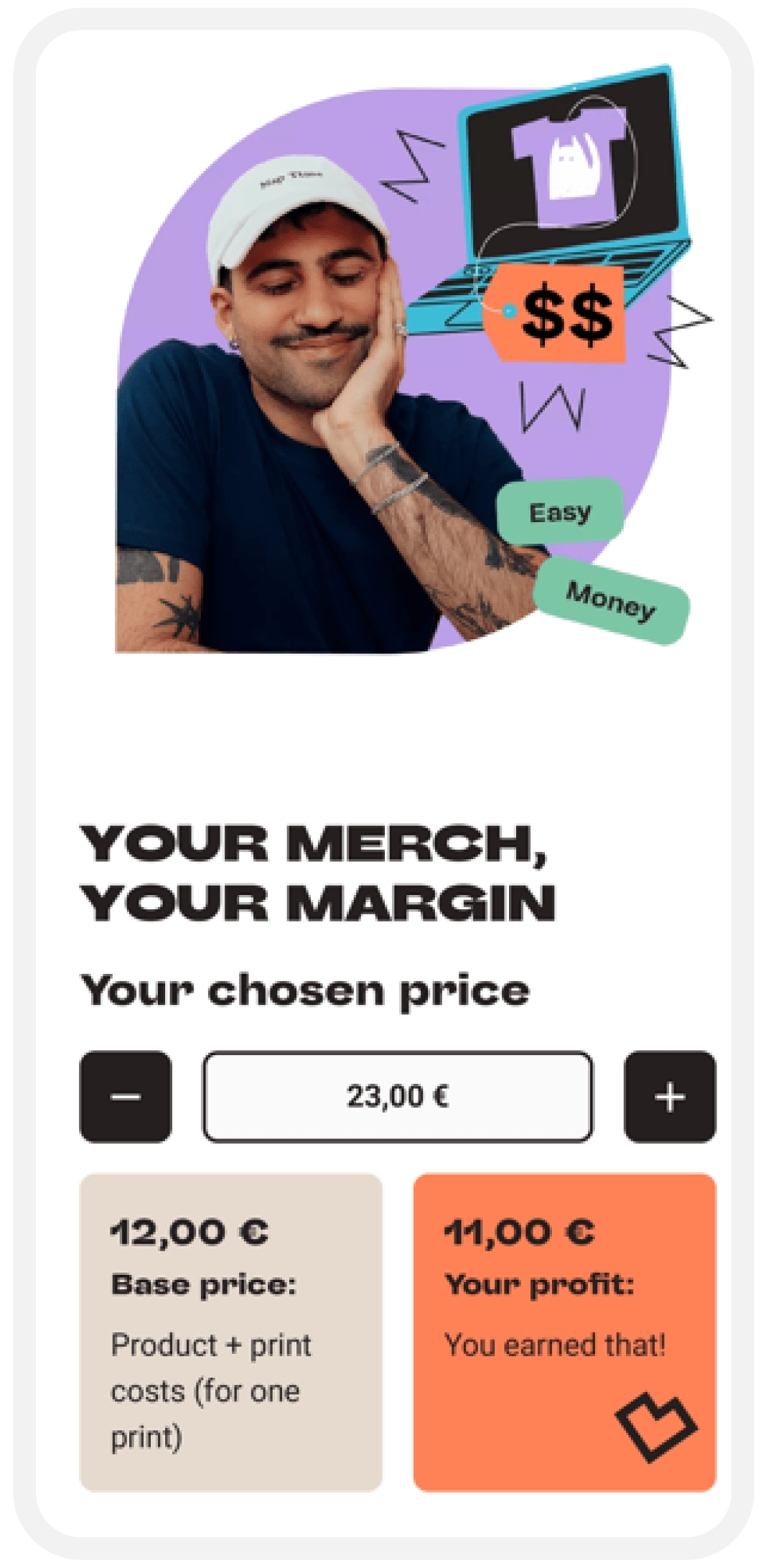
Spreadshop mobile interface screen 2
Spreadshop mobile interface screen 3
Spreadshop mobile interface screen 4
Spreadshop mobile interface screen 5
Spreadshop mobile interface screen 6

Before vs after

The redesign changes how the page works, not just how it looks.

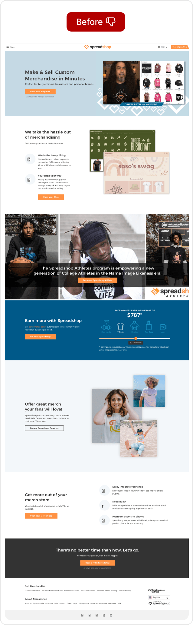
Spreadshop storefront before the redesign

-  Competing messages

-  Inconsistent visual styles

-  Benefits explained late

-  Longer path to clarity

-  CTA lost between sections
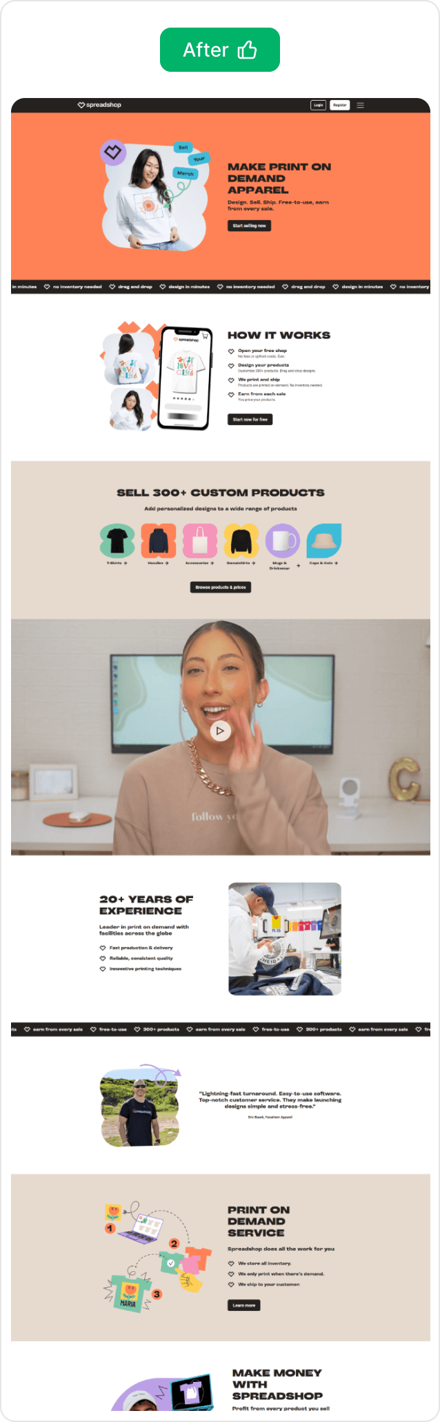
Spreadshop storefront after the redesign

+  One clear promise

+  Consistent hierarchy and actions

+  Risk and value explained early

+  Proof placed near decisions

+  CTA visible throughout the journey

Home Page Design

Complete Spreadshop mobile homepage design
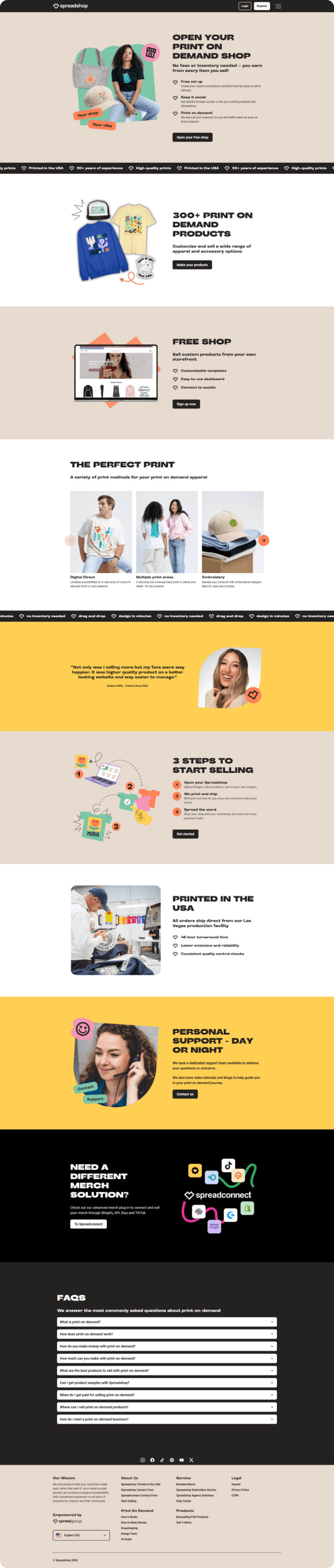
Complete Spreadshop desktop homepage design

Final verdict

Spreadshop Redesign

“The most effective redesigns do not add more. They subtract everything that stands between the user and their intent.”
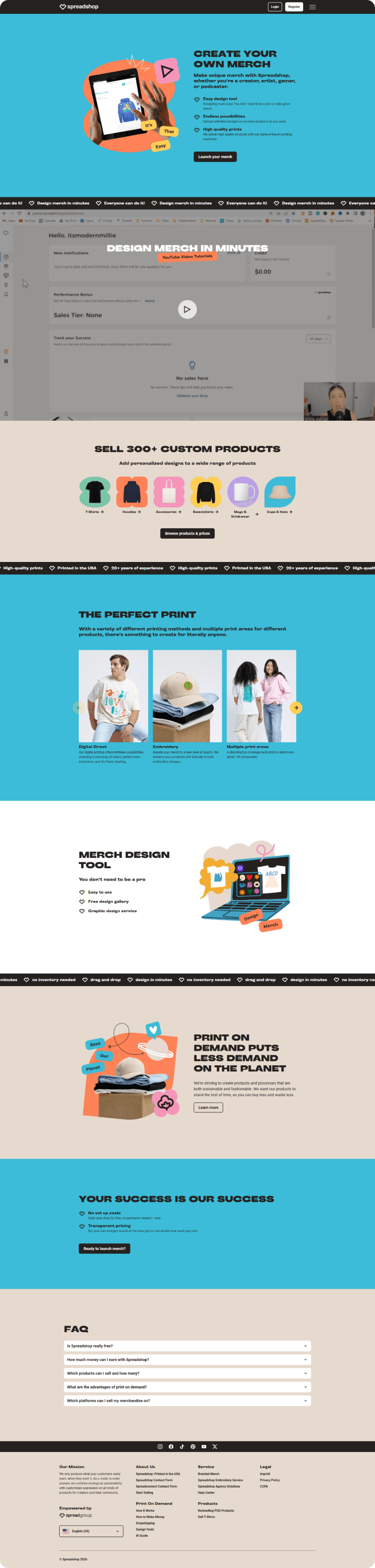
Spreadshop Create Merch page
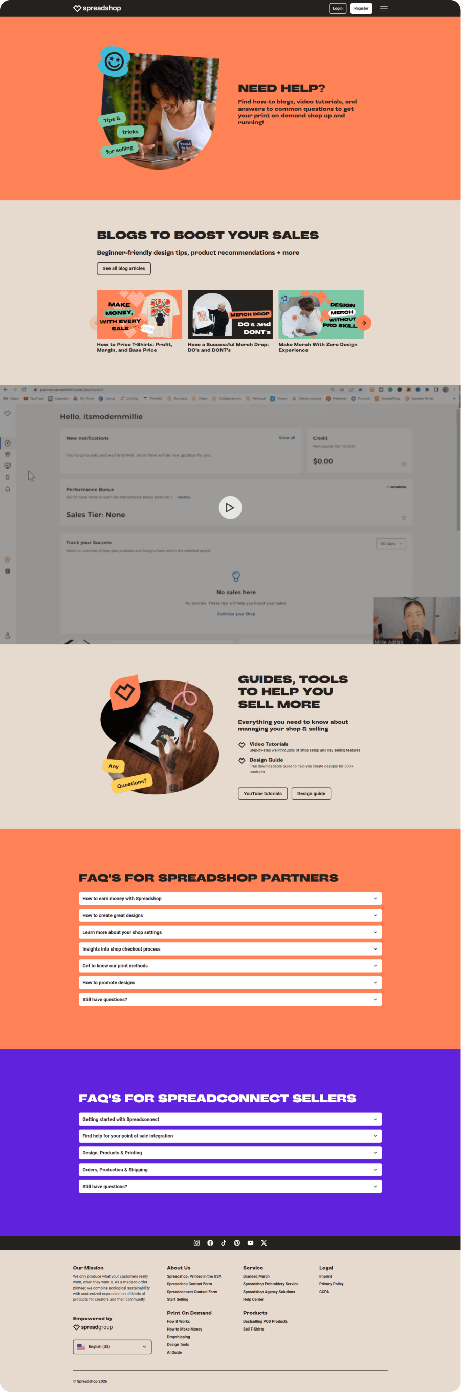
Spreadshop Help Center page
Spreadshop Free Merch Shop page
Spreadshop Products page

Services behind the work

Looking for a similar result?