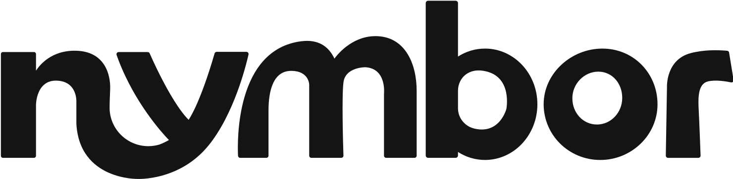
01 / Logo System
Marks that work everywhere.
Primary logo, secondary lockups, icon marks, spacing rules, and usage logic so the logo does not break across formats.

BRAND IDENTITY
For founders and small teams who need a sharper identity, a clearer visual system, and less back-and-forth getting there.
Starting at $1,000

THE METHOD
Your identity should make every touchpoint feel connected, from the first logo mark to the website, social posts, packaging, pitch deck, and launch assets.
01 / Logo System
Primary logo, secondary lockups, icon marks, spacing rules, and usage logic so the logo does not break across formats.
02 / Color + Type
Color palettes and typography systems that give the brand a clear feeling, not a random set of pretty choices.
03 / Brand Direction
Mood, references, layout style, imagery direction, and graphic behavior so the whole brand has a point of view.
04 / Graphic Elements
Patterns, icons, shapes, labels, social treatments, and visual devices that help the brand show up consistently.
05 / Brand Guidelines
A clean brand guide your team can actually use, covering logo, color, type, spacing, layout, and real examples.
06 / Launch Assets
Starter assets for social, website, packaging, deck, print, or marketing so the identity is not stuck inside a PDF.
DIAGNOSTIC BLOCK
When the identity is unclear, everything after it becomes harder: the website, content, ads, sales deck, product visuals, and trust.
The logo feels amateur or unfinished.
The brand feels credible from the first impression.
Every post, page, and asset looks different.
Everything follows one clear visual system.
The website feels disconnected from the brand.
The identity gives the website a stronger direction.
The business looks cheaper than the value it offers.
The brand supports premium pricing and trust.
The team keeps guessing what looks right.
The guide gives everyone clear rules to follow.
Design decisions slow everything down.
New assets become faster and easier to create.
PROOF OF WORK
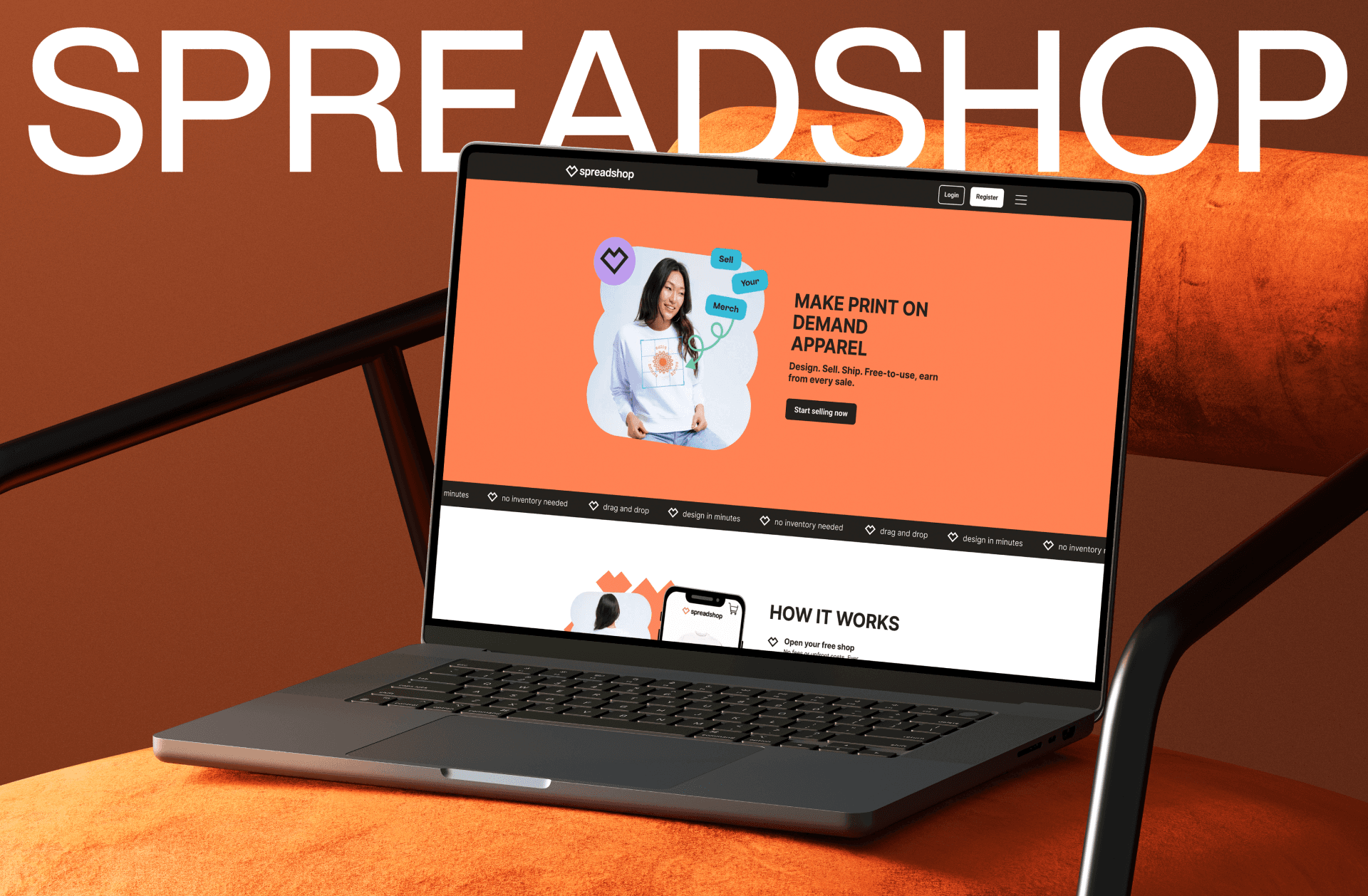
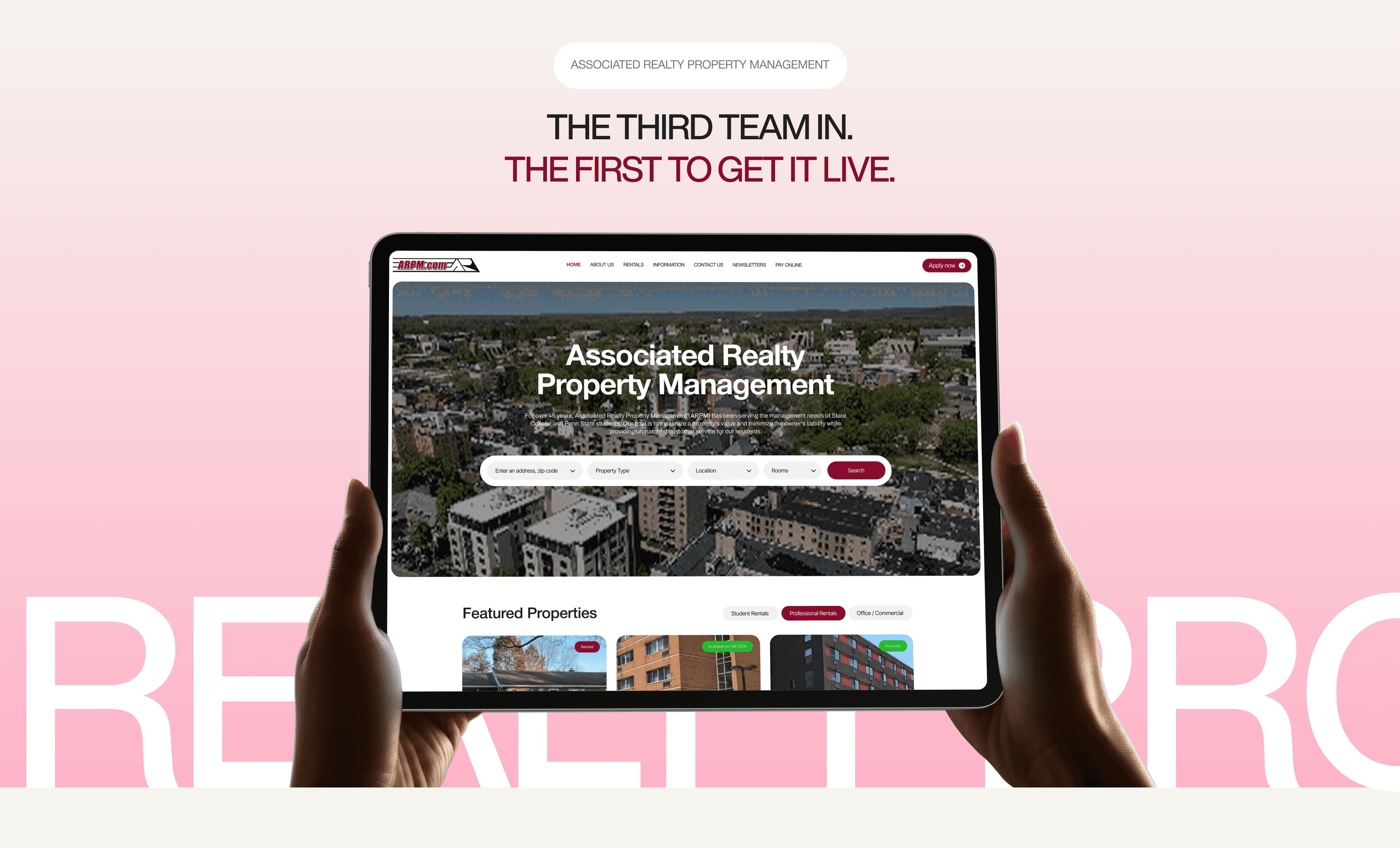
A few identity directions, campaigns, and visual systems built to make the business easier to recognize, explain, and launch.
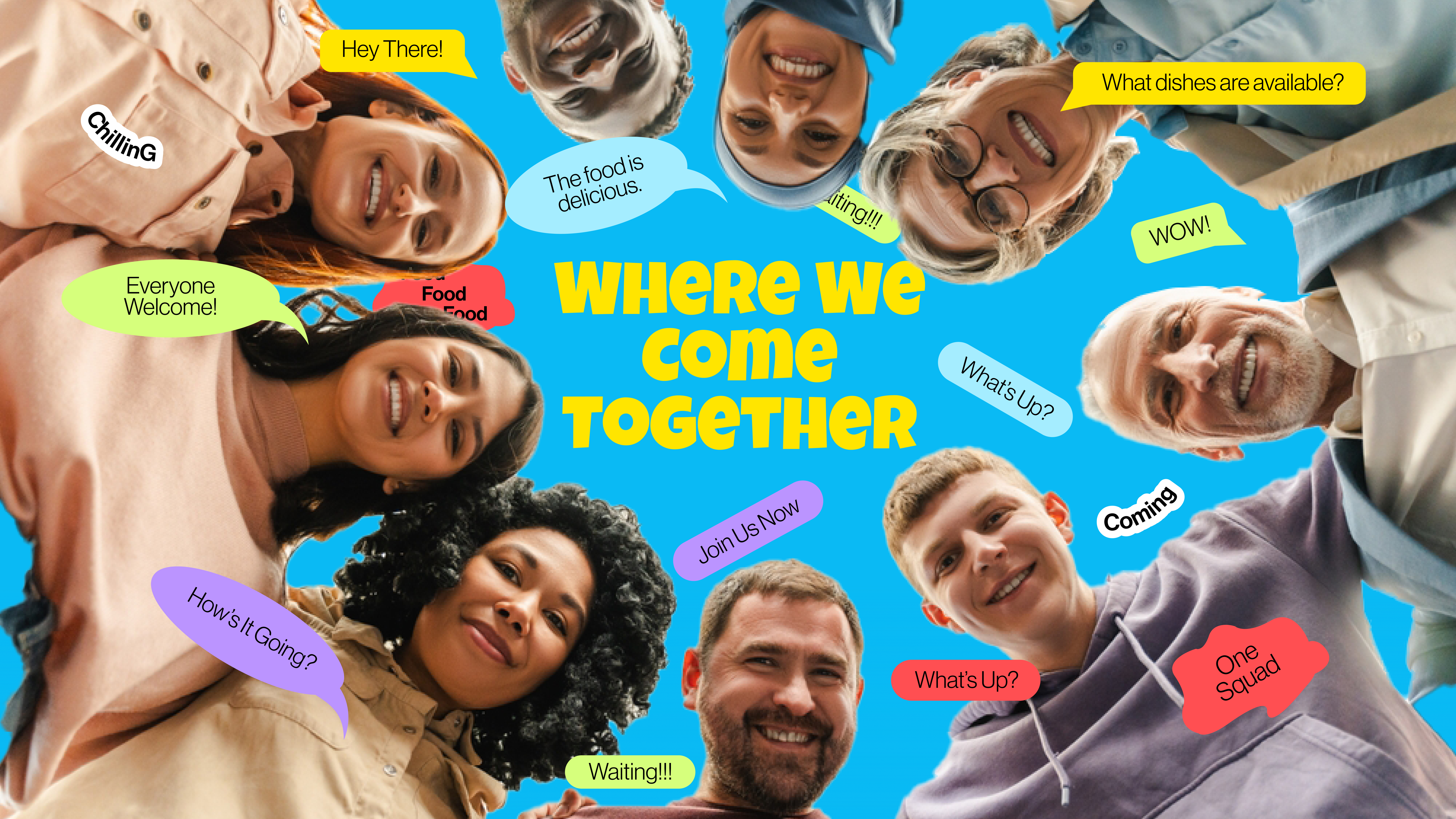
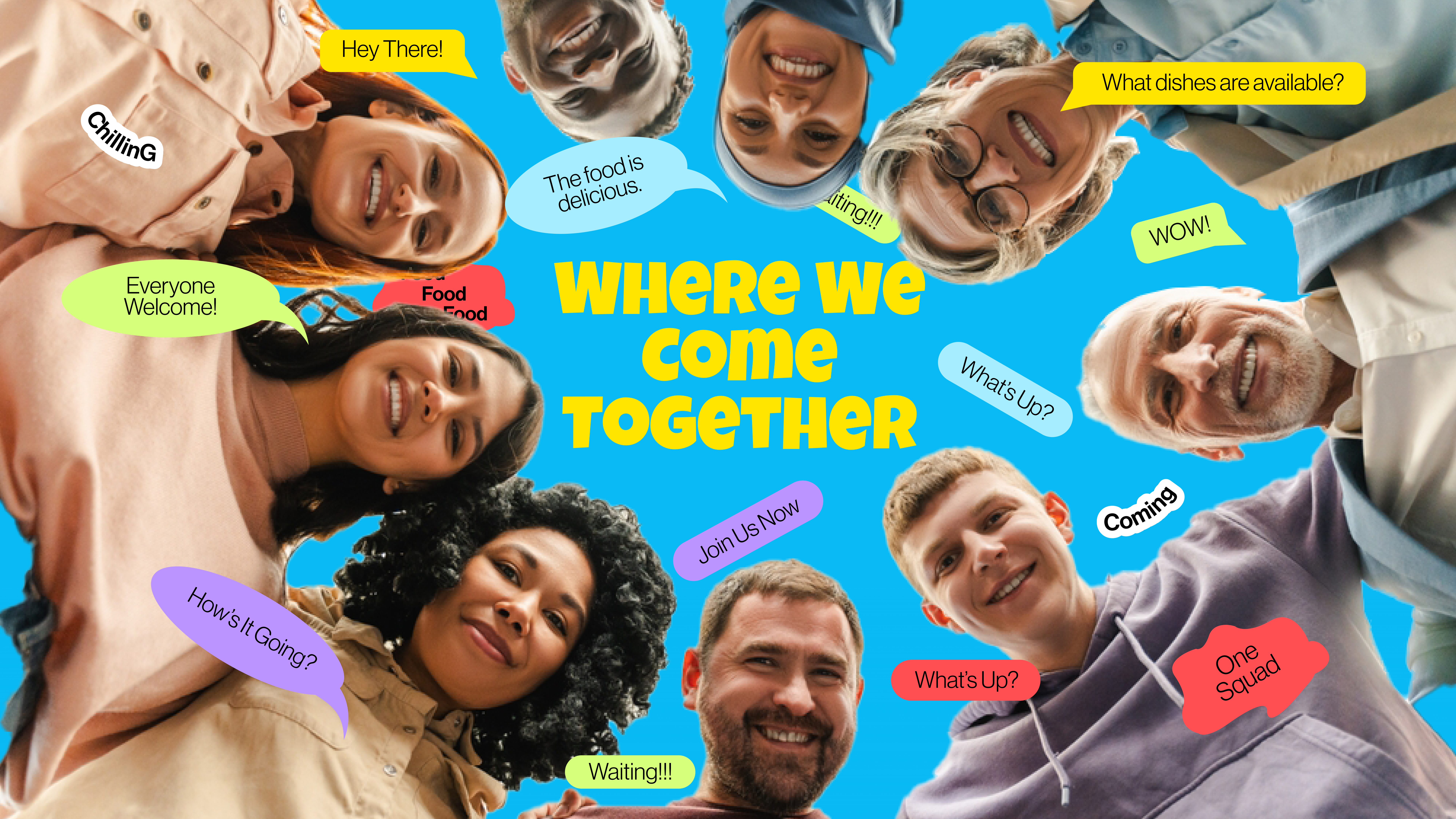
A lively identity direction with playful graphic language, social-ready assets, and a more memorable brand presence.
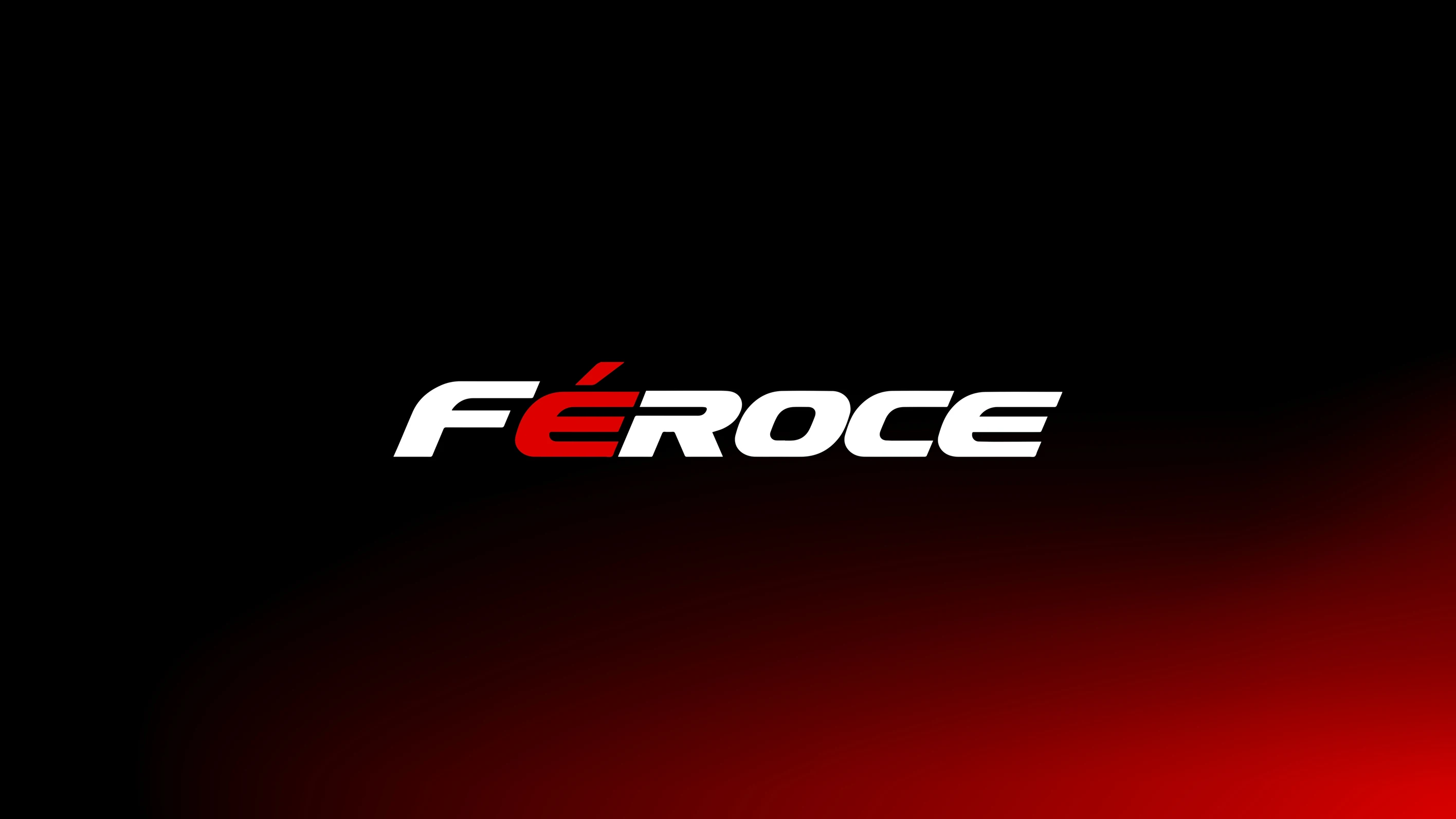
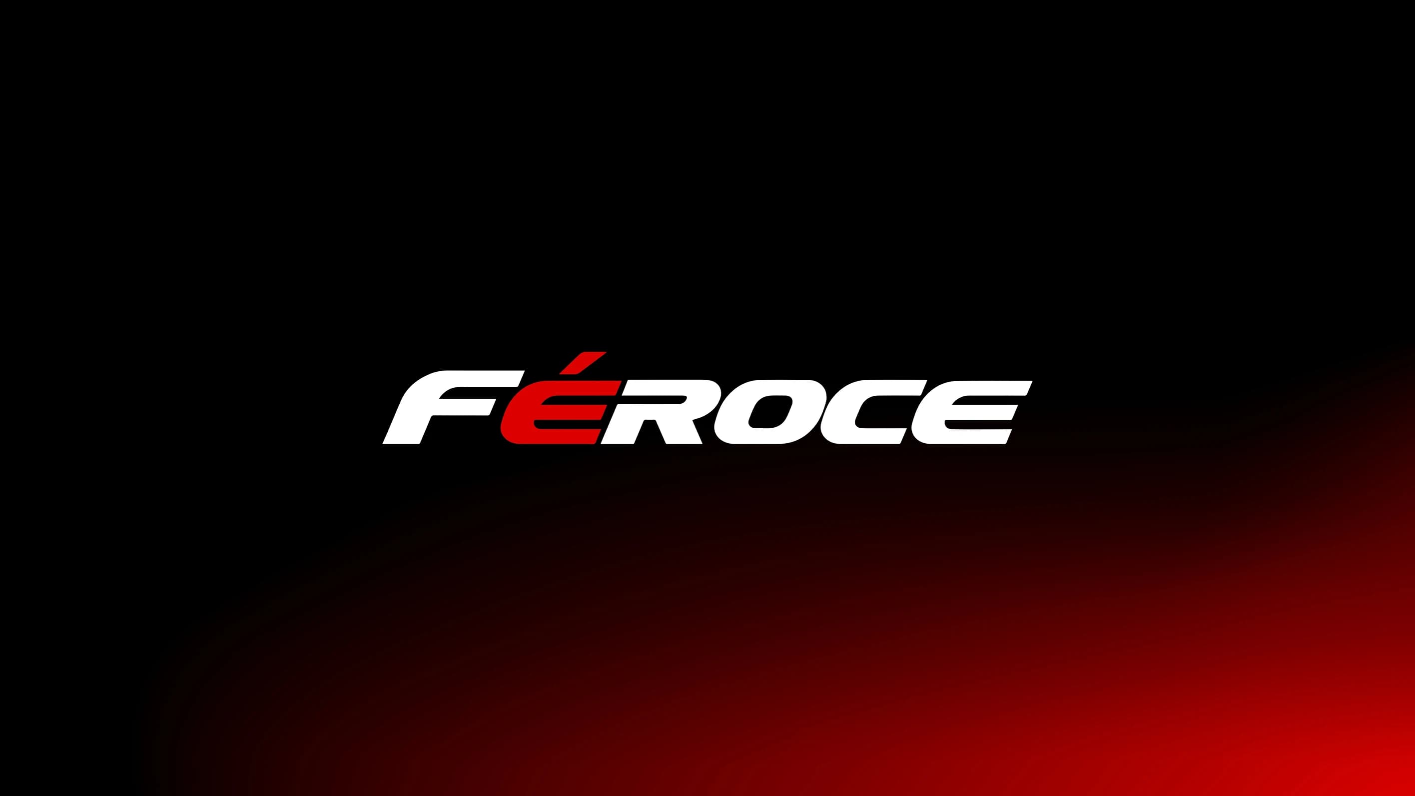
A fearless visual system with bold typography, race-bred energy, and a consistent identity built to move fast.
THE PIPELINE
We focus on speed, precision, and collaboration. No endless stakeholder loops. Just beautiful, functional brand systems delivered on time.
01 // Phase
We understand the business, audience, competitors, and the feeling the brand needs to own.
02 // Phase
We build visual routes with logo directions, colors, typography, references, and early brand worlds.
03 // Phase
We refine the strongest direction into a usable identity system that can stretch across real assets.
04 // Phase
We package the final files, guidelines, and launch assets so the brand is easy to use after delivery.
Related proof
Looking for something more custom?
Send your brief. We'll look at what you have, scope it honestly, and tell you if we're not the right fit.