
01 // Hierarchy
Users do not know what matters first.
Too much visual noise, weak hierarchy, competing type, and no clear focal point.

INTERFACE DESIGN
For founders and small teams who need a sharper identity, cleaner site, and less back-and-forth getting there.
Starting at $1,500
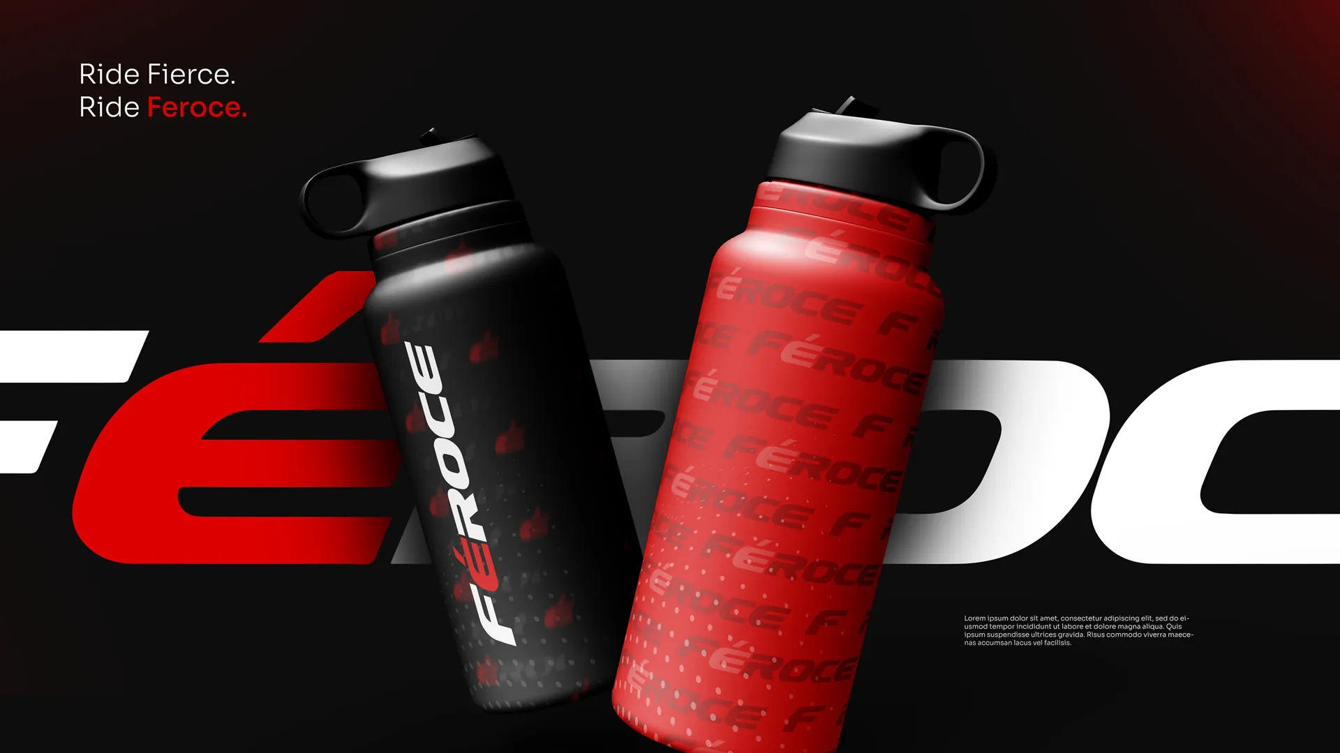
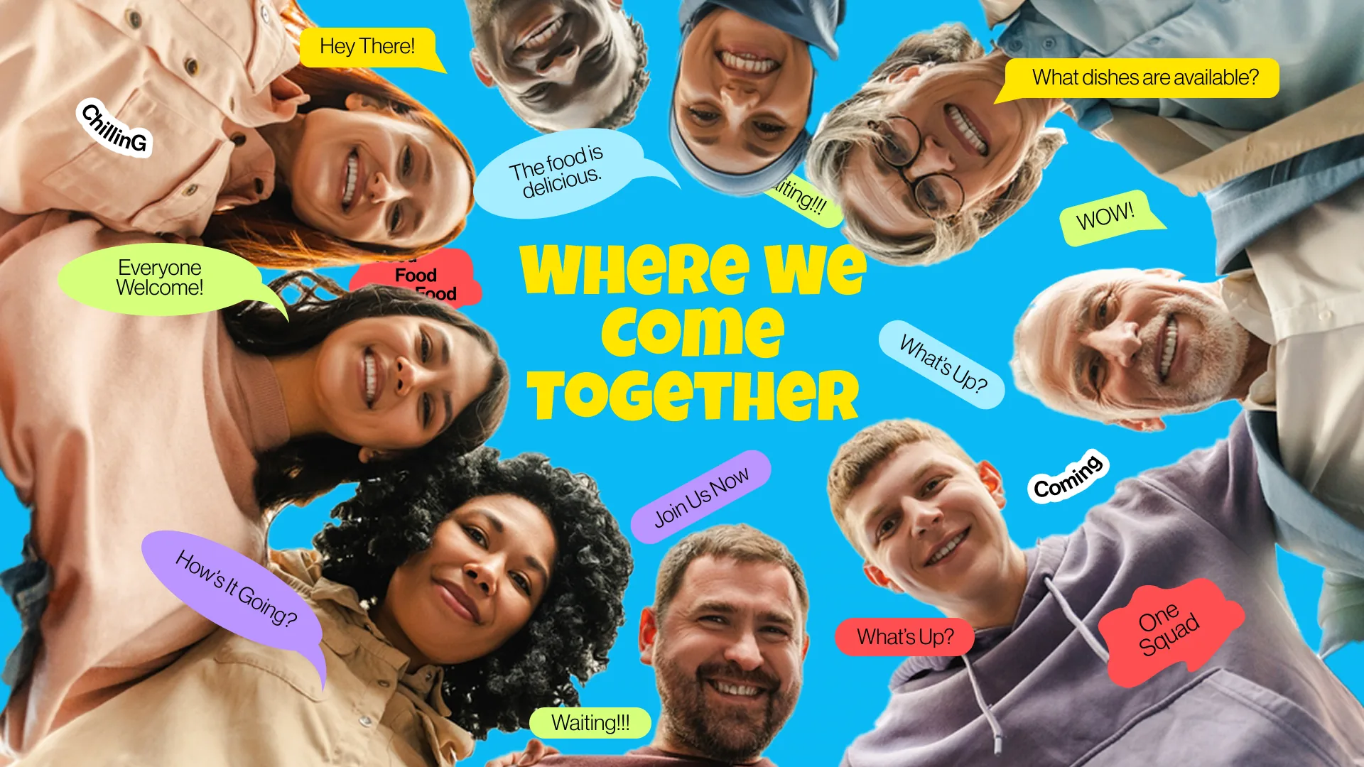
DIAGNOSIS SYSTEM
A beautiful layout cannot save a page with bad hierarchy. Users don't stay to solve complex puzzles-they leave. Here are three interface failures we fix:
01 // Hierarchy
Too much visual noise, weak hierarchy, competing type, and no clear focal point.
02 // Decision Path
Key actions get lost in the layout, forcing users to scroll too far to act.
03 // Build Ready
Strong in static mockups, but missing responsive behavior, interaction states, and spacing logic.
DECISION ENGINE
Before we polish the layout with typography and color, we decide what the user needs to notice, understand, believe, compare, and do. That gives the interface a job instead of just a look.
One clear focal point with a strong headline and key visual, without competing messages.
We make your offer instantly clear with scannable content, sharp microcopy, and clear labels.
Social proof and results placed near key decisions to reduce hesitation.
Clear pricing, comparisons, and interactive tools that make choosing effortless.
A high-contrast CTA with clear, direct wording.
"92% of product drop-offs occur because users are asked to decide, trust, and act at the exact same vertical space. Spacing decision points across a structured path raises transaction flow by up to 34%."
THE REBUILD COMPARISON
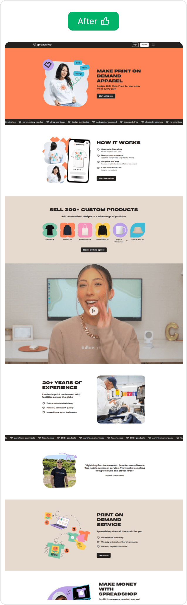
We don't just shift buttons or swap color codes. We restructure the logical hierarchy, content order, and interaction cues to drive immediate action. Click highlighted nodes to analyze:
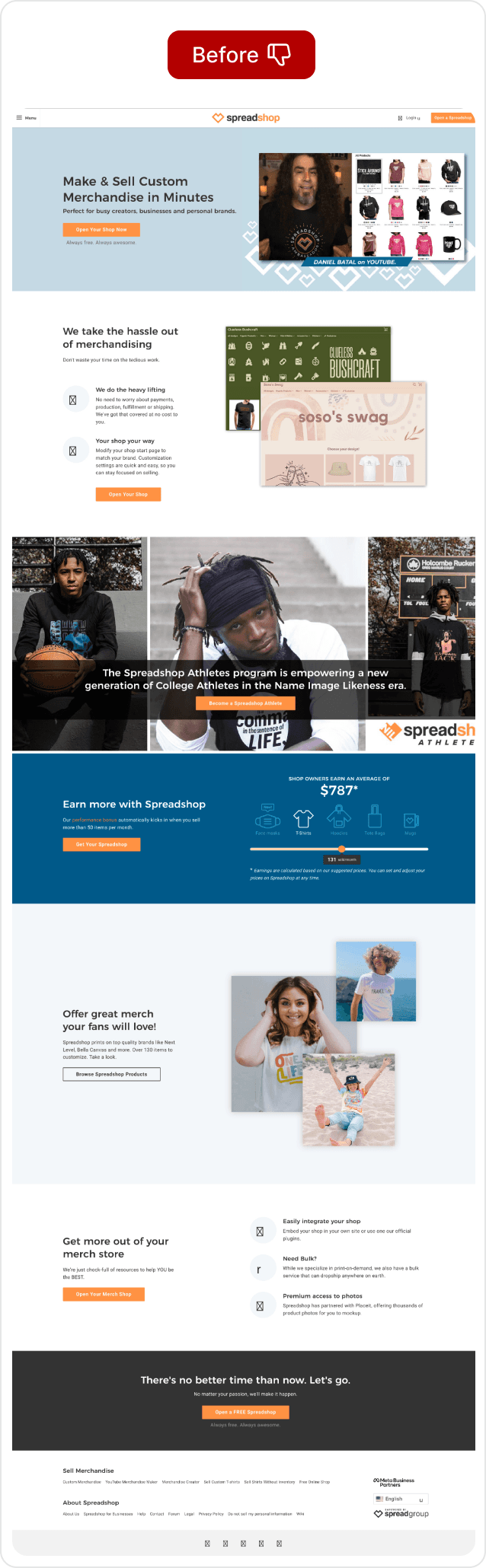
Result 01
Users notice your core value immediately above the browser fold.
Result 02
Action components stand out cleanly without visual distractions.
Result 03
No truncated texts. Rebuilt specifically for comfortable thumb-tap flows.
Result 04
Components match browser spacing rules out of the box. Zero visual guesswork.
PROOF / LIVE WORK
THE SYSTEM
Our timeline is optimized for fast production loops, structured reviews, and zero developer rework. No endless back-and-forth slides:
Phase 01 / Path Audit
We identify drop-off points, competing elements, and the metrics that need to improve.
Phase 02 / User Movement
We map page flow, user actions, and responsive behavior before styling.
Phase 03 / Wireframe Structure
We define hierarchy, spacing, and action areas in greyscale before styling.
Phase 04 / Visual UI System
We apply brand colors, typography, visuals, interaction states, and polished screen specs.
Phase 05 / Figma Prepare
We deliver responsive screens, reusable components, style guides, and developer-ready handoff.
Phase 06 / Review Loop
We tighten edge cases, mobile behavior, and final details before the interface moves into build.
Related proof
Looking for something more custom?
Send us your current active page URL, sketch mockup, or custom strategy goals. We will identify the friction points, structure the decision path, and design a pristine interface focused on action.